Homepage spotlights
About this component
The spotlights section of the homepage shows important and timely information for prospective and current students. The spotlights may also highlight upcoming featured events, current campaigns, and marketing efforts.
Guidelines
- The homepage committee meets monthly to go over content for the spotlights, which update weekly.
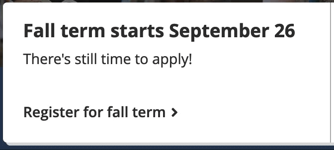
- Spotlights include a complete heading, a short description, and a call to action.
- Spotlights link to a page with supporting information.
- Headings: should fit on one line on standard desktop screens, and be complete and able to stand alone (since only the headings show on small screens).
- Descriptions: At most two lines on standard desktop screens. Provide more info.
- Calls to action: Include a verb and describe where the spotlight links to.
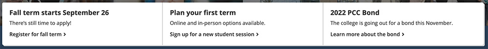
- Spotlight outline:
- Spotlight 1: A date relevant to current and incoming students.
- Spotlight 2: Information relevant to current and incoming students – could be another upcoming date or a student support service.
- Spotlight 3: Flexible – a place to post college-wide announcements or events, or a student support service.
- Yes: vote, signature events, in-service or holiday closures, sign up for weather alerts, etc.
- No: budget hearings, donate to PCC, department closures, individual programs or classes, etc.
- We have common spotlight content in Spaces.
Styling
The spotlights slightly overlap the collage. There are always three spotlights, each with a heading, description, and call to action. They all link to a page with supporting information. Like callouts and buttons, the call-to-action arrows have a subtle animation on hover and focus, and the container boxes use the same shadow treatment as the callouts and buttons on the page.
Spotlights don’t include images. In cases where the information is really important, but not important enough for the red alert bar, we can add a Font Awesome icon at the start of the heading. Icons should be avoided in most cases, though.
Responsive behavior for Homepage spotlights
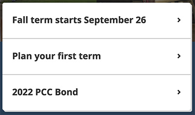
The full spotlight boxes show on large and medium screens. On small screens, the spotlights stack vertically, and only the heading shows. This is why it’s important the headings are complete and can stand alone without the description and call to action.
How to use for Homepage spotlights
Editable in the HTML (see “development info”).
Development info for Homepage spotlights
Stylesheet location:
/_source/homepage/styles/_spotlights.scss
/_source/homepage/styles/_cards.scss
Edit the root-level index.html file. The call-to-action arrows are added by the script, no need to add them manually.
<div class="small-12 medium-4 cell info card">
  <a href="">
    <h3>Heading</h3>
    <p>Description</p>
    <p class="call-to-action">Call to action</p>
  </a>
</div>
Example of Homepage spotlights
Desktop and tablet view
Phone view
Animation