Homepage buttons
About this component
Buttons on the homepage are essentially the same as other buttons on the pcc.edu website, but have a few different color options.
Styling
- The teal buttons (for use on white backgrounds) are the same as basic buttons.
- The green apply button is the same as enroll buttons with a little extra padding.
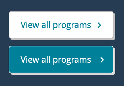
- The white buttons (for use on color backgrounds) are white. Their hover state on blue backgrounds is teal, and their hover state on teal backgrounds is blue.
How to use for Homepage buttons
Editable in the HTML (see “development info”).
Development info for Homepage buttons
Stylesheet location:
/_source/homepage/styles/_buttons.scss
The arrow is added in the script, no need to add it manually.
Basic buttons (teal):
<a class="button" href="">Button text</a>
Apply buttons (green):
<a class="button green" href="">Button text</a>
White buttons:
On blue: <a class="button white" href="">Button text</a>
On teal: <a class="button white on-teal" href="">Button text</a>
Example of Homepage buttons
Basic buttons
See an example of basic buttons.
Apply button
See an example of enroll buttons.
White buttons
White on blue buttons:
White on teal buttons: