This content was published: April 18, 2018. Phone numbers, email addresses, and other information may have changed.
ALCHEMY Literary Magazine Contest Winners
Van Wheeler
Alchemy is a student-run magazine of literature and art. While taking Sylvania’s Editing & Publishing classes, students solicit, select, and edit the submitted work, which showcases PCC students as well as established writers and artists. This year’s team would like to say “congratulations” to this year’s Alchemy contest winners!
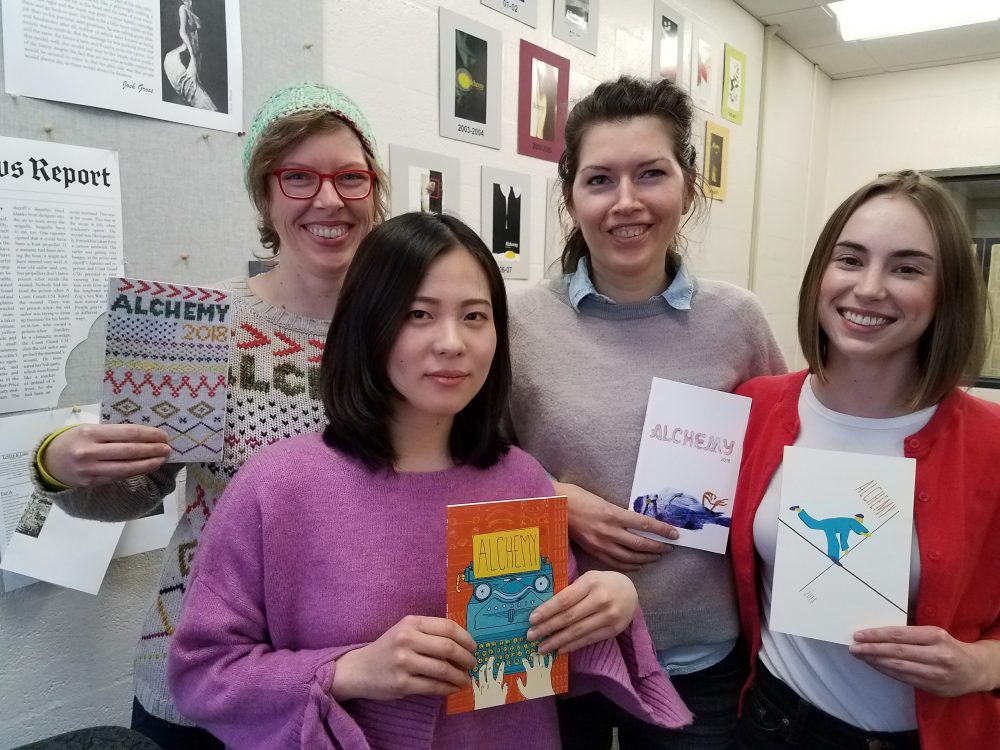
Each year, Sylvania’s literature and art magazine selects its cover from work by a graphic design class, this year taught by Daniel Soucy. We wanted you to hear the “back stories” of these pieces of these pieces we find so intriguing…
2nd place, Corinna Scott:
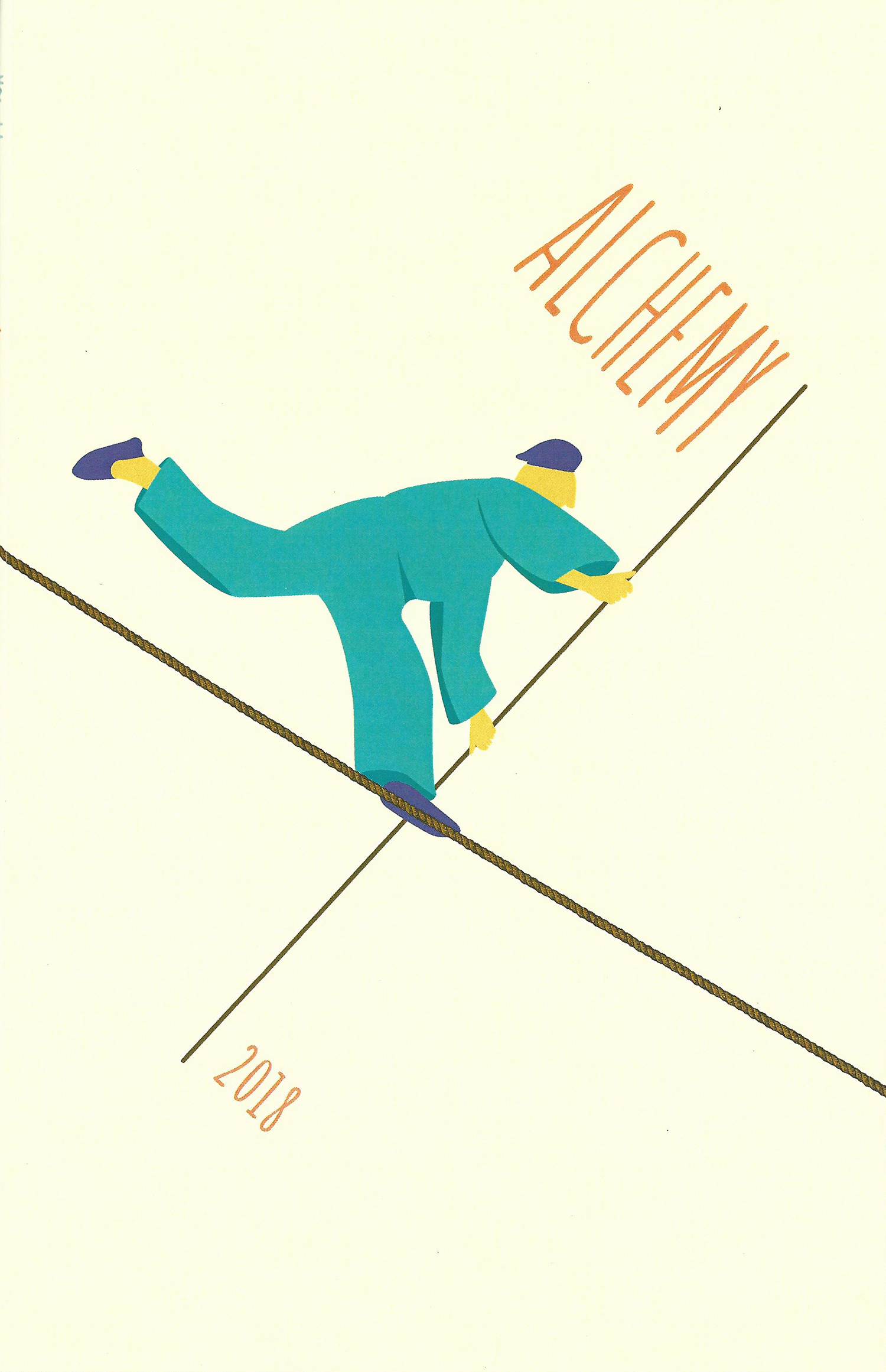
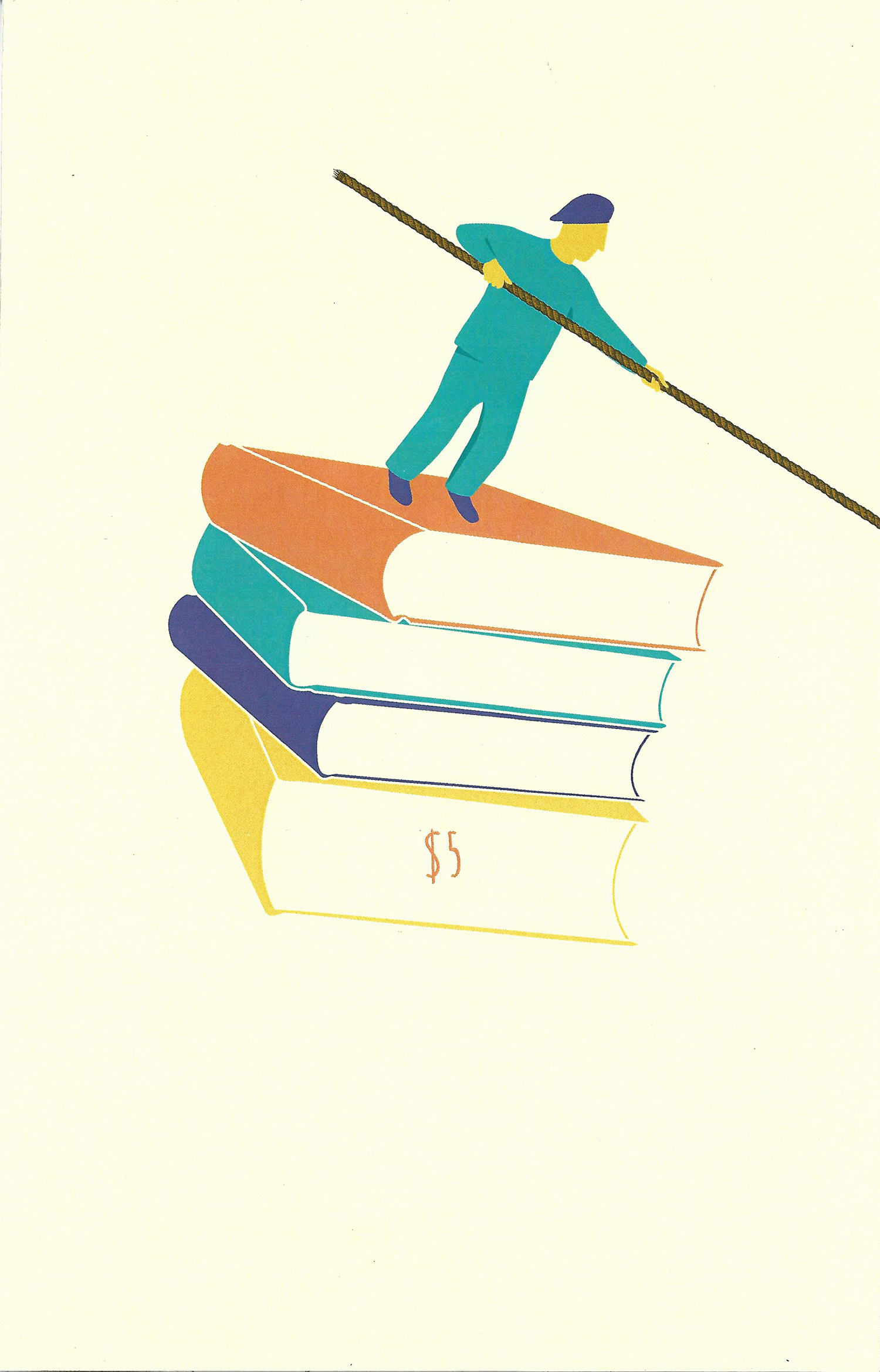
I began this project by thinking about the contents of this literary compilation. I imagine that the contents of Alchemy will be quite varied, but that each piece will be a story/journey for the viewer/reader to experience. I started brain storming imagery that would convey taking a journey. Then Leon Russell’s song “Tight Rope” popped into my mind. “Yes,” I thought, “literally and metaphorically, walking a tight rope is taking a difficult and brave journey.” It’s also a bit of a romantic image, in my opinion.
I wanted to tackle the proposed challenge of making the design connect across the back and front of the book cover. That’s how this tight rope image developed in this surreal direction. The back of the cover reveals that the tight rope walker is being supported by a character standing on floating books, holding one end of the rope. It’s impossible. And now both characters are essentially being supported by a pile of books, which can represent knowledge and experience through written words.
So this cover is a literal, metaphorical and surreal image of taking a journey, and that journey being supported by written words.
– Corinna Scott
Tied for 3rd Place, Seunghoi An:
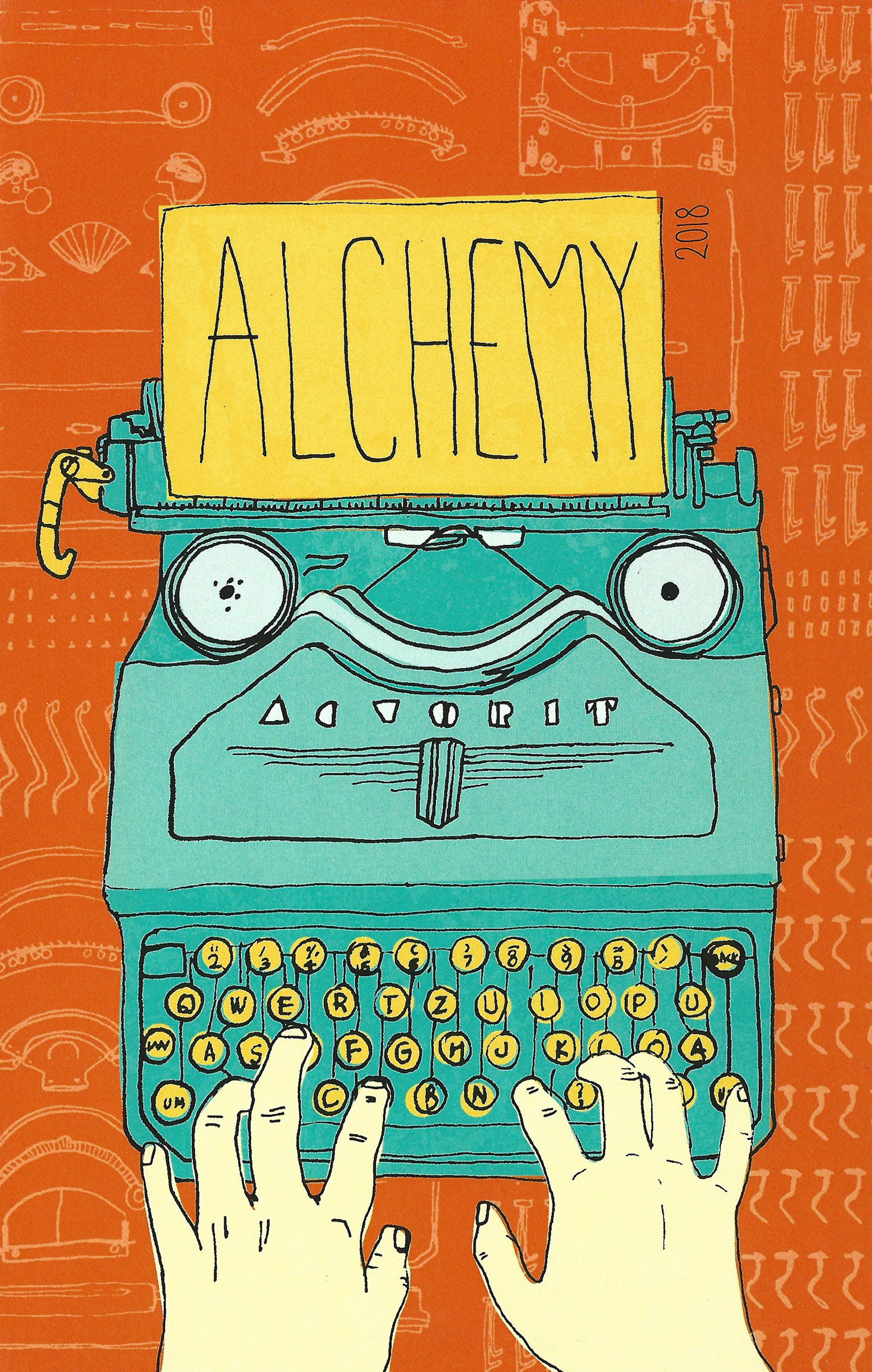
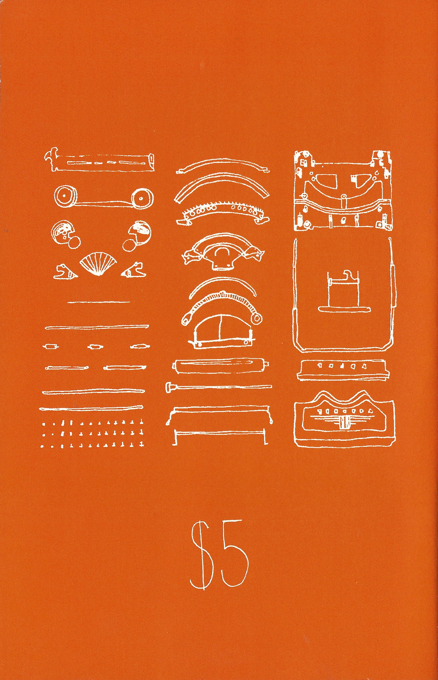
There’s a mini stationery in downtown, Portland. I used to go there and just look around the store when I lived in downtown. There is a fancy vintage typewriter that everybody can try. I loved the sound when I typed a letter. It was so different than a computer. I thought Alchemy was similar to a typewriter.
A typewriter looks simple and easy to use. If I push the letter, it would print on the paper. However, it takes so much effort and time to make that machine. I was mesmerized when I saw all of the parts inside of typewriter. Alchemy is also made by so many talented people and their effort and time. I want people to appreciate how much commitment it takes in order to make something.
— Seunghoi An
Tied for 3rd Place, Lee Meredith:
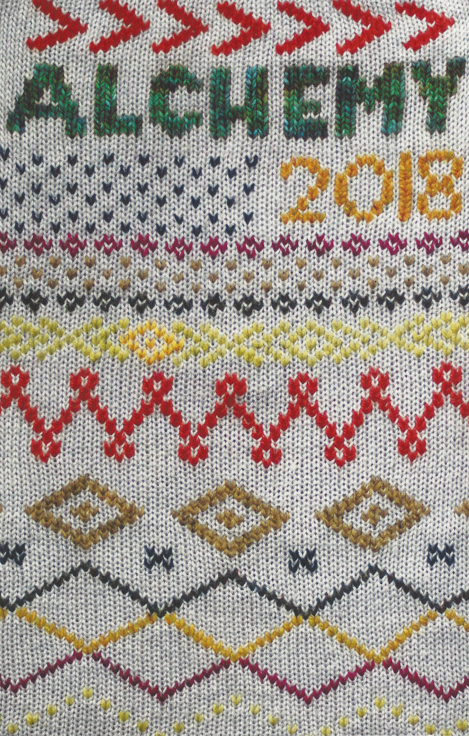
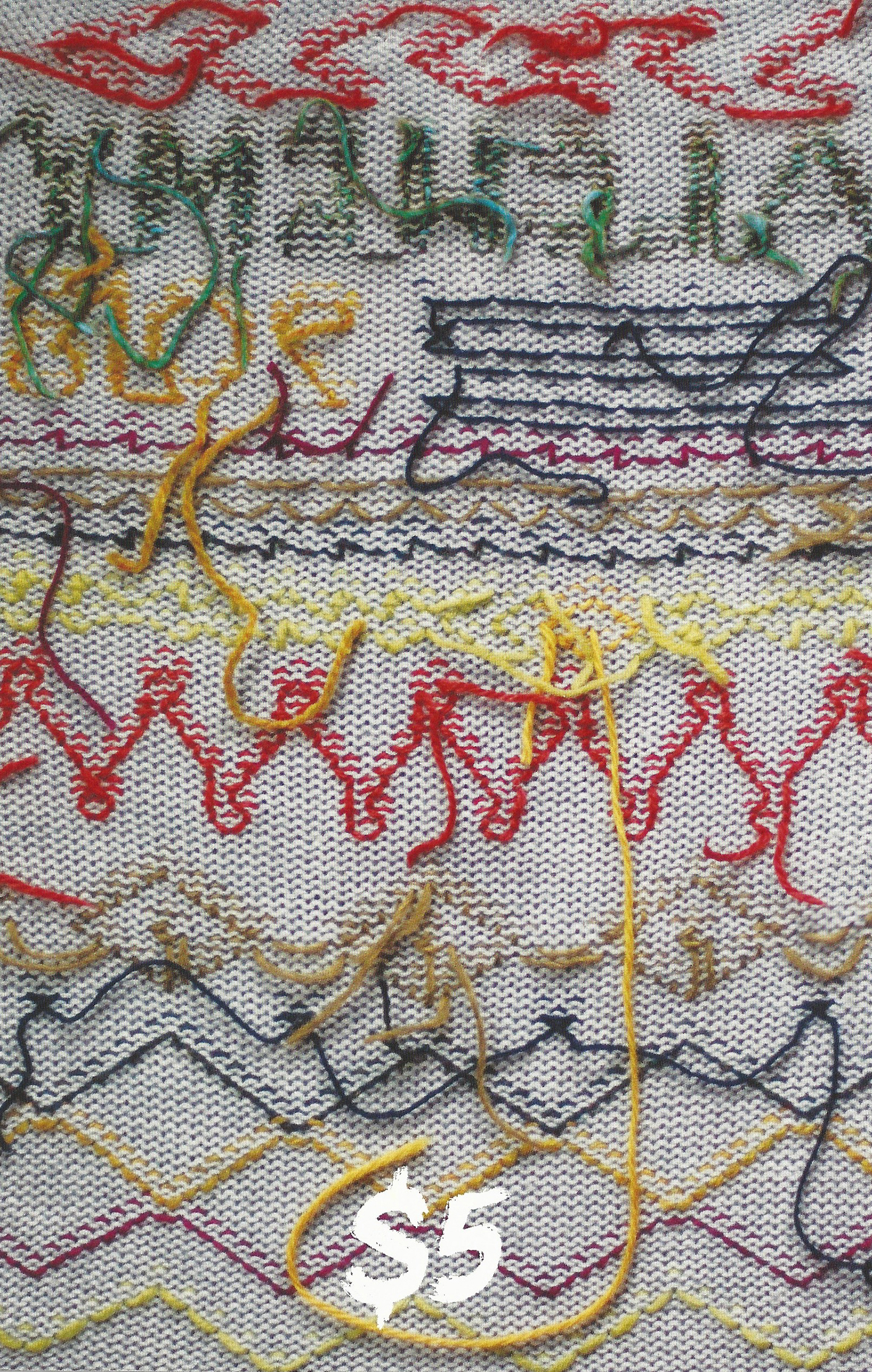
When I thought about the theme of transformation, I thought of my experience with crafting, and specifically with making old things new again or transforming simple things into beautiful objects through craft. I decided to transform an old grey sweater into a book cover by stitching onto it with colorful yarn.
I’ve had an interest in design my whole life, but it took me until halfway into my 30’s to realize that graphic design was my perfect career. I spent my younger years pursuing art and photography, but it never really clicked and I found myself distracted by craft projects and knitting… and then I turned that into a career by becoming a knitting pattern designer for about ten years. When I started to get burned out running my own business doing that, I realized how much I loved designing the page layouts for the knitting patterns, and it hit me that graphic design was a perfect fit for my strengths and interests.
I would love to design book covers in the future! That’s pretty much my dream job. Other things I’d love to design are album covers, fabric patterns, movie posters, and magazine spreads. I love page layout but am also very interested in illustration, so I don’t know where I’ll end up!
— Lee Meredith
And in First Place, our cover winner, Olga Khristoforova:
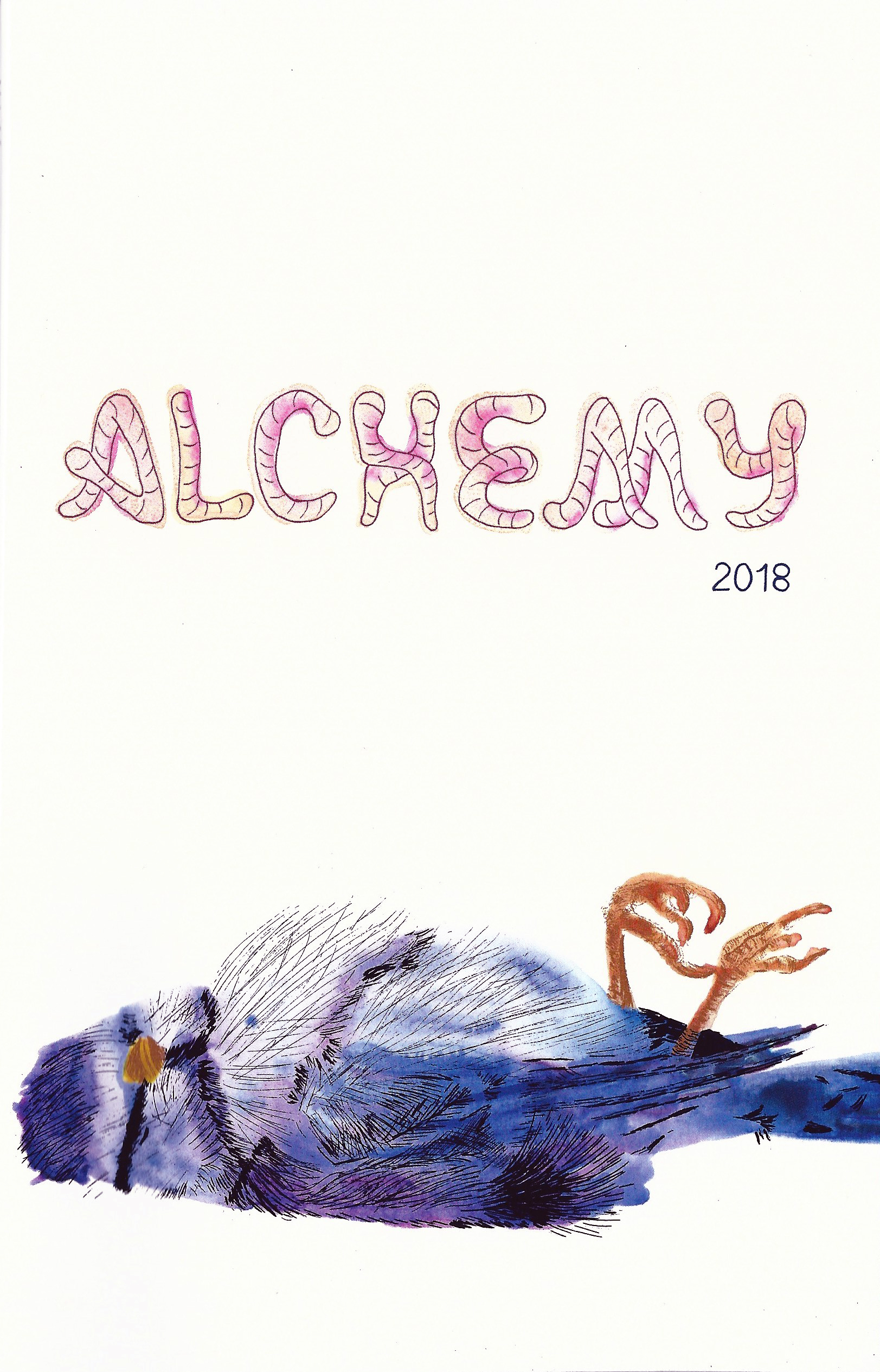
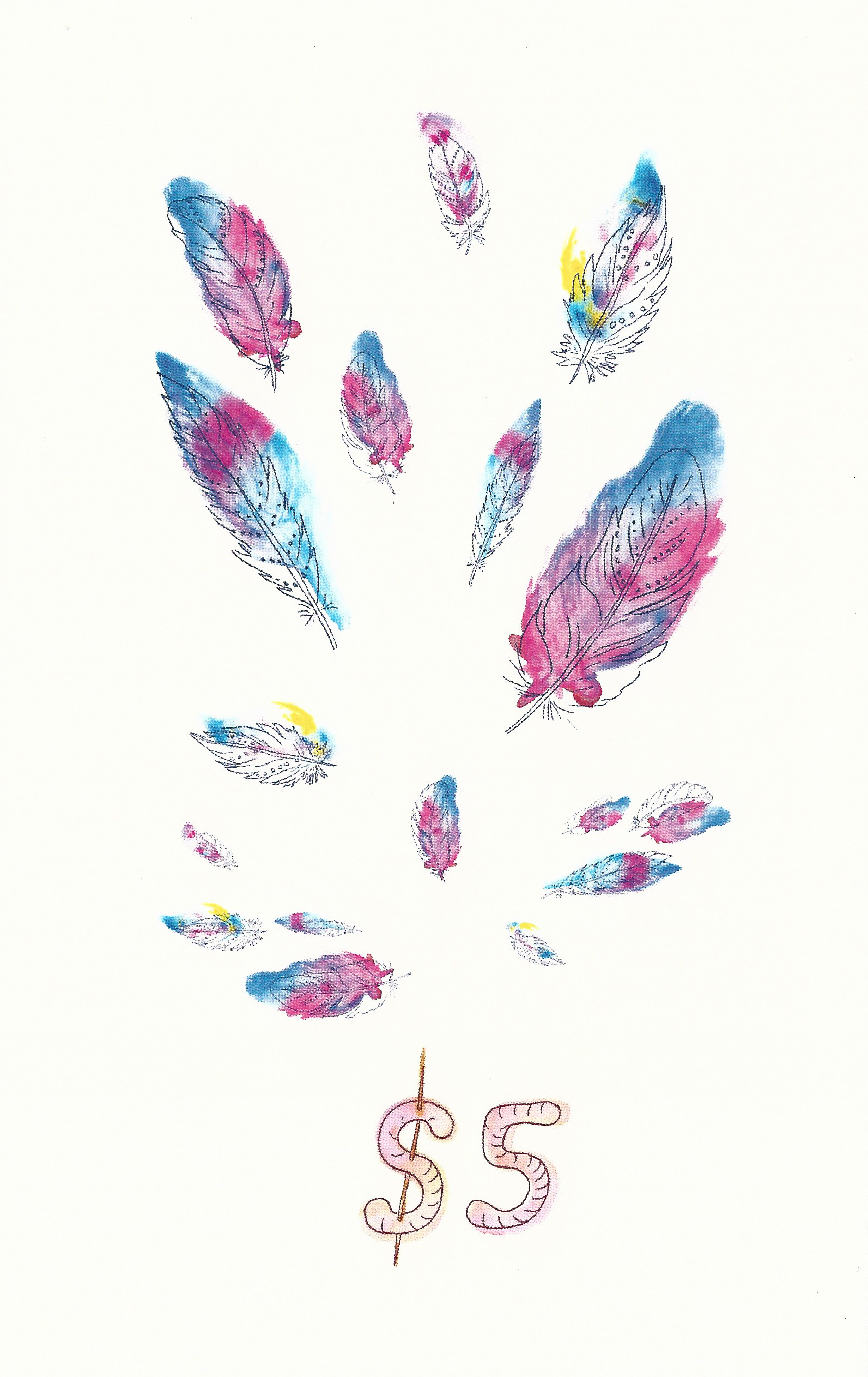
I wanted to convey the message of alchemy without being obvious and predictable. The dead bird illustration for the cover came to me as a beautiful and dramatic representation of the immortality of art. The worm typography pulls the viewer away from “the tragedy” and makes him smile. The colorful feather explosion on the back cover reminds us that we must celebrate life in every moment.
— Olga Khristoforova
Thanks to all the designers who submitted work. Please keep your eye out for Alchemy’s 44th edition, which will arrive near the end of Spring term.
Vandoren Wheeler (Alchemy’s faculty advisor). For more information contact Van at Van.wheeler@pcc.edu.