Color palette
Consistent use of color supports visual cohesion and leverages an emotional resonance with our brand. It’s a powerful way to help people get to know the college’s unique style and increase the impact of our storytelling.
Brand colors
One of the ways that Portland Community College creates visual continuity and impact is through consistent use of brand colors. Aside from our logo, PCC Turquoise is the most identifiable element of our college. The college’s primary colors are PCC Turquoise and Glacier White. These two colors provide a palette that can be adapted for multiple audiences as needed. In general, turquoise should be emphasized over all other colors. If white serves as a primary color, then turquoise should be utilized as an accent color.
Primary color palette

PCC Turquoise
Turquoise symbolizes creativity, self-expression, and a welcoming, cheerful confidence. Its connection to nature conveys a sense of peace, while representing a level of trustworthiness that our college embodies.
PCC TURQUOISE
PMS 3135c
CMYK 100 / 23.36 / 29.48 / 1.15
RGB 0 / 142 / 170
HEX 008EAA

Glacier White
The color white evokes a sense of refreshing calm and a new beginning. White light contains all the colors of the spectrum, meaning it’s an inclusive, impartial color that evokes a sense of simplicity and quality.
GLACIER WHITE
CMYK 1 / 1 / 1 / 0
RGB 250 / 250 / 250
HEX FAFAFA
Color builds
When possible, projects should be printed using the Pantone Matching System values (PMS 3135c). If spot colors are not available, the CMYK values should be used. To translate our brand thoughtfully for digital audiences, we’ve created web-specific values of our color palettes, using the HEX and RGB color builds.
Supporting colors
Although our color system relies heavily on turquoise and white, we understand the need to complement that palette with a vibrant set of additional colors. This full set of supporting colors was pulled from nature and developed to help elevate and enrich our marketing materials while speaking to a variety of audiences. Please use these colors sparingly and only to help promote PCC’s Turquoise and Glacier White.
Supportive color palette

Panther Navy
Panther Navy evokes strength and stability. Its deep, rich color connects us to our environment and provides a sense of reliability, dependability, quality and sophistication. The color helps us stay rooted in college history, while also allowing our turquoise to shine.
PANTHER NAVY
PMS 2955c
CMYK 100 / 60 / 10 / 53
RGB 0 / 56 / 101
HEX 003865

Rain Gray
Rain Gray is a timeless, understated and sophisticated neutral color. It acts as a confident, dynamic and versatile pillar of strength and structure. Rain gray is an accessible, softer alternative to pure black and best used for text color in digital communications.
RAIN GRAY
PMS 425c
CMYK 63 / 51 / 45 / 33
RGB 84 / 88 / 89
HEX 595959
Accent color palette

Salmon Pink
Salmon Pink offers a level of youthful friendliness that’s sociable and outgoing. It’s a free-spirited color that matches the level of brightness our turquoise brings to the table. Its unexpected presence in our palette reflects PCC itself – a college that often exceeds expectations through the opportunities and support it provides. Salmon pink also helps illustrate that PCC is a vibrant part of our community.
SALMON PINK
PMS 170c
CMYK 0 / 48 / 50 / 0
RGB 255 / 134 / 116
HEX FF8571

Daffodil Yellow
Daffodil Yellow can only be described as energetic happiness. It evokes confidence and symbolizes friendship, gratitude and new beginnings. It’s the only color that can match our brand color’s vibrancy, making it the perfect complement to our turquoise. Daffodil Yellow should only be used for graphic elements or text on a navy background.
DAFFODIL YELLOW
PMS 803c
CMYK 0 / 5.47 / 97.71 / 0
RGB 255 / 232 / 0
HEX FFE80A

Lichen Green
Lichen Green evokes a sense of vitality, sustainability and growth. It’s bright, playful and energetic. The color helps connect us to our natural environment, and creates feelings of calmness, motivation and optimism. Lichen Green represents student success and a place where everyone can thrive.
LICHEN GREEN
PMS 383c
CMYK 29 / 1 / 100 / 18
RGB 168 / 173 / 0
HEX A8AD00
Use supporting colors sparingly
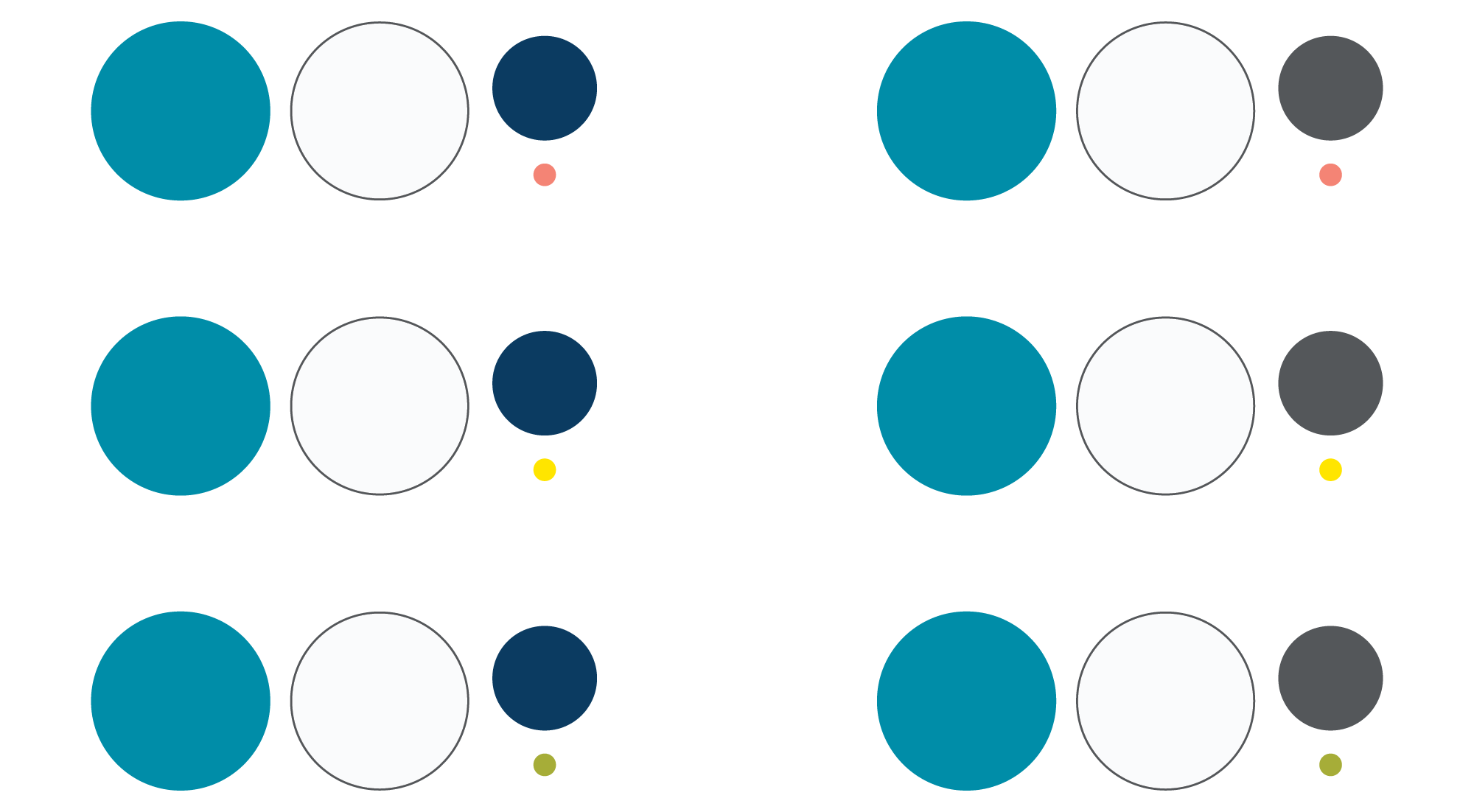
To make your project successful, we suggest only choosing two supporting colors to enhance PCC Turquoise and Glacier White. Try choosing only ONE cool and ONE warm color. A successful layout will never include the use of every supporting color option.
Palette combination examples
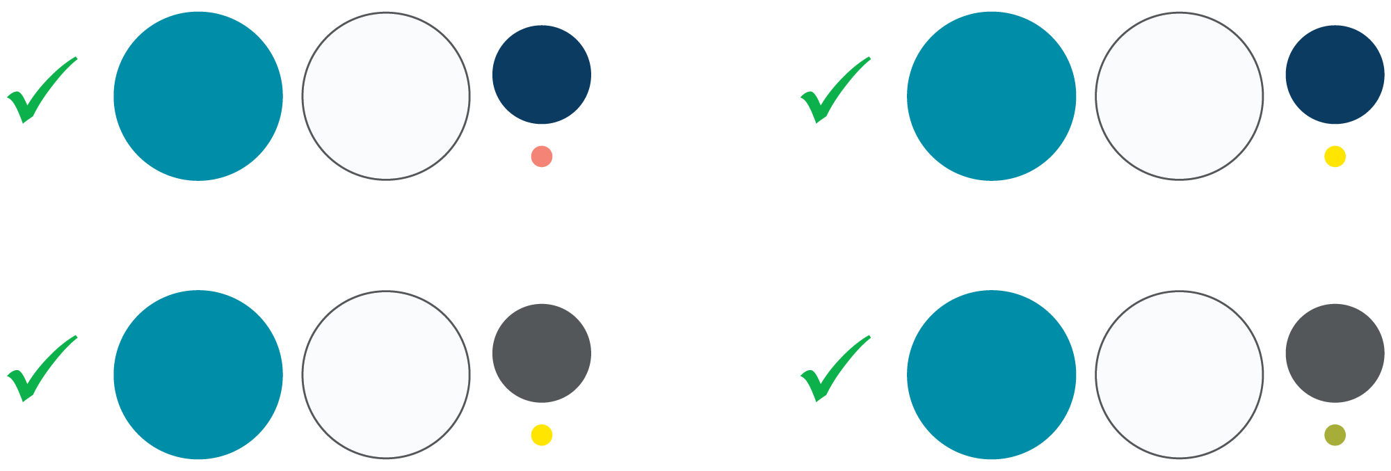
Brand color dos and don’ts
far fa check circle Brand color dos
- Do use our primary PCC Turquoise and Glacier White dominantly in all types of communications (web, print, email, video, etc.).
- Do use supporting and accent colors sparingly.
- Do include plenty of clear space in your layout.
- Do use the color builds provided on this page. When in doubt, use the HEX code.
- Do use accessible color combinations that offer plenty of contrast for all audiences. Check out our color palette accessibility chart below.
far fa times circle Brand color dont’s
- Do not alter or make changes to the colors of our trademarked logos and college marks.
- Do not alter, make changes, or convert the color builds provided.
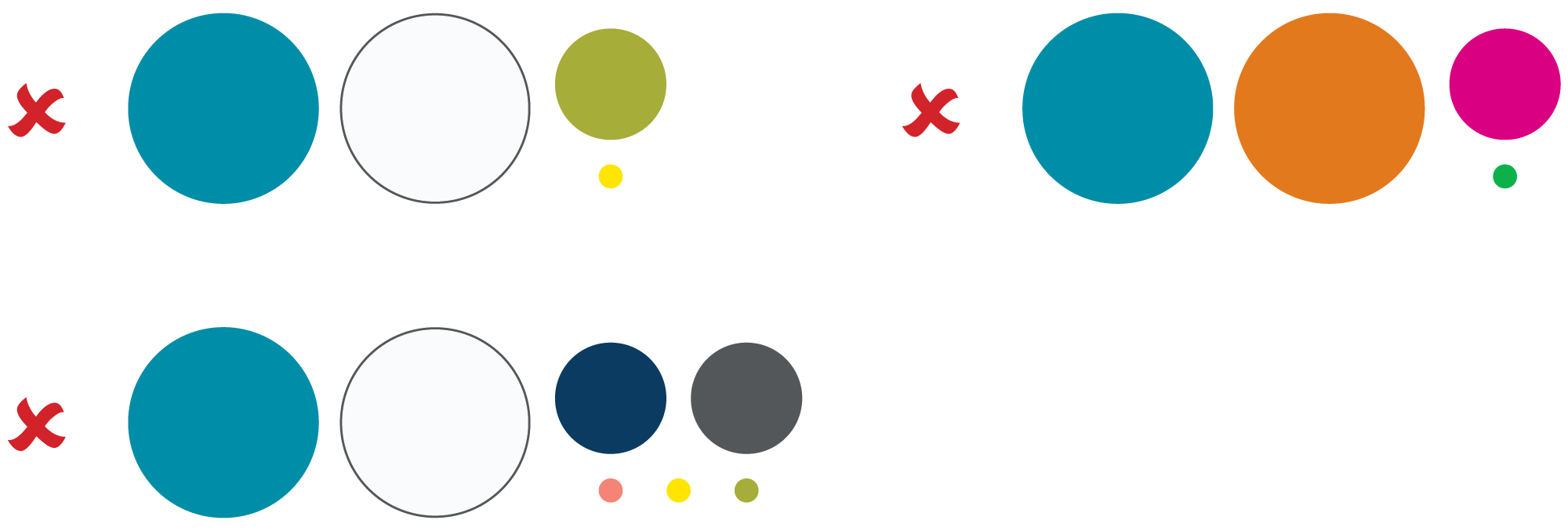
- Do not make supportive and accent colors prominent in your designs.
- Do not use every supportive and accent color option in your layout.
- Do not use color as the only indicator of importance or functionality. We don’t all see color the same way, so it’s key to call out important content by including additional visual cues, like size, weight, placement, or use of an image, symbol or glyph.
- Do not, under any circumstances, use a supportive or accent color as the predominant hue for an academic program, college initiative, department, campus, or center.
- Color combo don’ts:
- Do not use color combinations that are not accessible or are hard to read, such as white text on a yellow background.
- Do not use green and yellow together in large fields or in close proximity in any instance. We’ll leave that color combo to other institutions.
Incorrect palette combination examples
Color palette accessibility
PCC is committed to accessibility. When creating marketing materials it is important to design with accessibility in mind. Text and background colors should provide sufficient contrast to support readability for all audiences. It’s also important to avoid using color as the only way to differentiate information. For more information about formatting content that meets the college’s accessibility standards, please visit the Creating Accessible Content page.
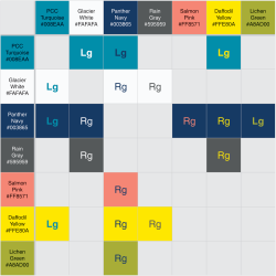 Please use this chart to determine what PCC brand colors can be used together and what color combinations should be avoided. Download the Color Palette Accessibility Chart.
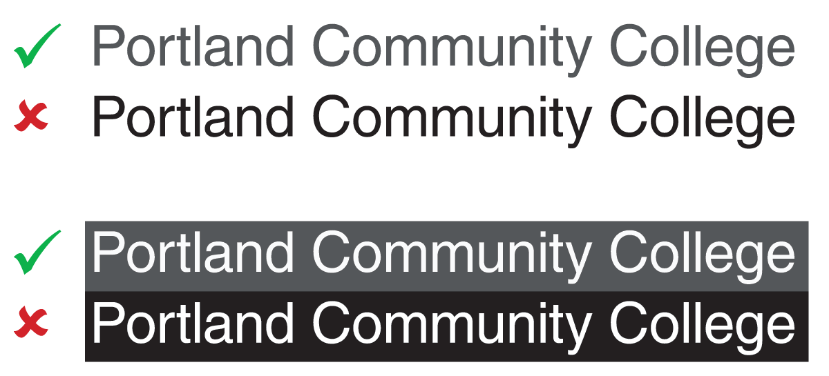
100% black text on a pure white background provides ample contrast, however some folks struggle to read content with too much contrast. For this reason PCC suggests the use of Rain Gray (HEX #59595) and Glacier White (HEX #FAFAFA). These softer alternatives continue to provide sufficient contrast, while also allowing folks with color sensitivities the ability to absorb information.
Brand color combinations
When building color combinations, be sure PCC Turquoise and Glacier White are predominate (approximately 60% of the design). Our supportive colors are there to enhance the turquoise (approximately 35% of the design) and our accent colors are for highlights or call-outs (approximately 5% of the design).
Palette combination examples