Global header
About this component
The global header appears (and remains the same) on all pages. It brands the page as belonging to PCC and provides top-level navigation for the website. The header includes:
- The PCC logo, which links back to the pcc.edu homepage.
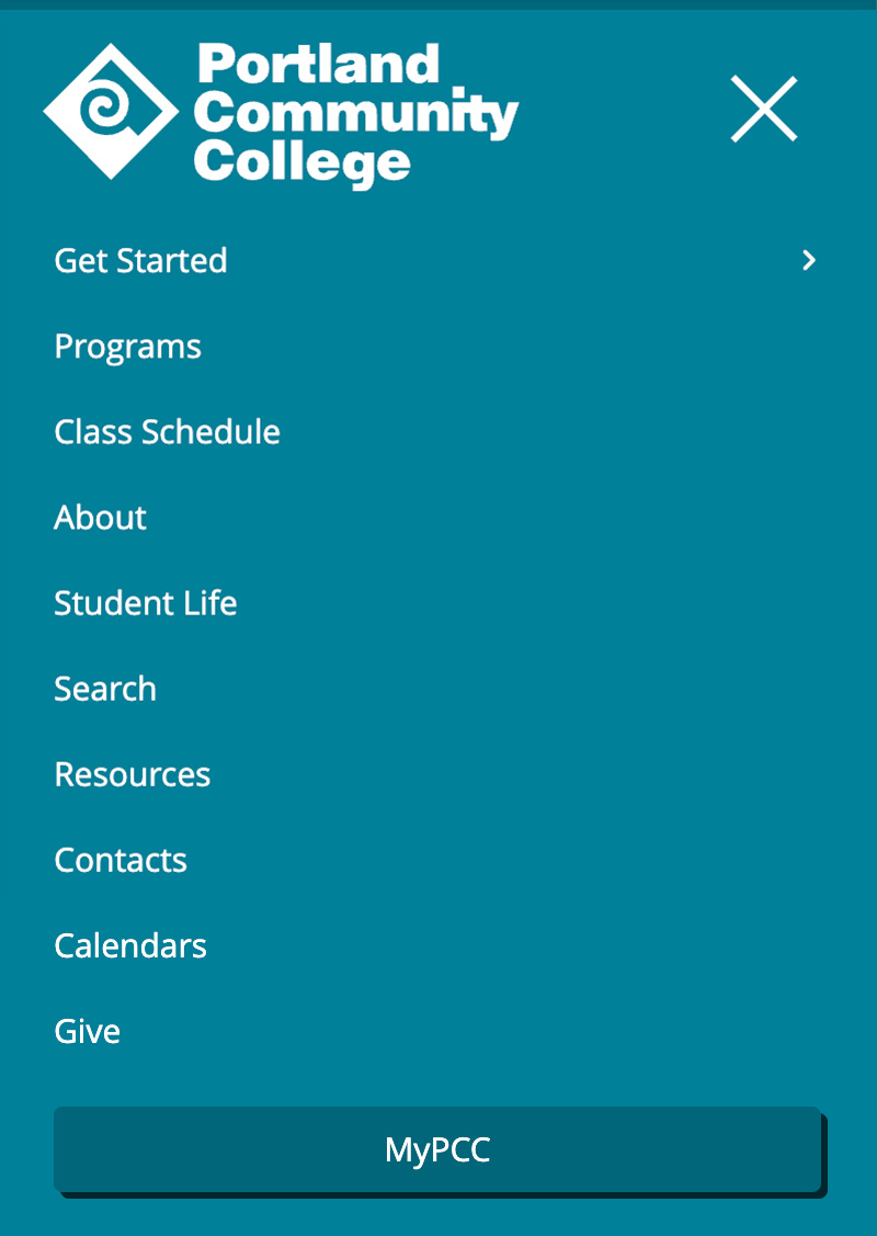
- The global navigation, which is divided into main and helper links.
- “Get started” opens the mega menu, which displays important information about enrolling at PCC.
- The link to MyPCC is highlighted – it’s the most heavily used link on the website and needs to be obvious at a glance.
Items in the global navigation were carefully considered to determine inclusion, importance, and placement. Any changes must be vetted through the PCC Web Team and other stakeholders.
Styling
The global header is PCC turquoise, which adds school spirit and puts PCC’s brand identity front and center. The white logo and links help the header separate visually from the dark content area text. The turquoise color is dark enough for the white text to be fully accessible.
The mega menu has multiple columns, each displaying important information for people looking to get started at PCC. It opens below the “Get started” link and has a dark blue background. A slick opening animation helps add visual interest.
The high-traffic MyPCC link is highlighted using a darker turquoise background to make it look more like a button. The link is also given optimum placement for visibility in the upper right corner of all pages.
The header is 100% the width of the screen on the homepage and a maximum of 65rem (1040px) on all other pages (the homepage uses a full-screen layout, unlike other pages on the site).
Responsive behavior for Global header
The helper navigation items have accompanying icons on large screens, and only the icons (with hidden accessible text) appear on medium screens. There are no icons on small screens.
On wider medium screens, the helper navigation stays on the far right side of the page. As the screen shrinks, they move into a horizontal line above the main navigation.
On small screens, the navigation collapses to a hamburger menu icon to the right of the logo. When expanded, the navigation items appear below the header. None of the items have icons. When you tap the hamburger icon, it animates into an X, and the menu opens smoothly. The megamenu then slides in from the right when opened.
The mega menu has three columns on large screens, two on medium screens (the image column disappears), and one on small screens (all content, but stacked).
How to use for Global header
Only available in the main website theme.
Development info for Global header
Stylesheet location:
/_source/styles/layout/_header.scss
/_source/styles/layout/_navigation.scss
/_source/styles/layout/_megamenu.scss
To update the mega menu content, edit the file at /_source/scripts/content/megamenu.html
Example of Global header
Desktop view


Tablet view


Phone view