Channel column layouts
Each tab in MyPCC can use a different column layout. Luminis has built-in layouts to choose from, but we added a custom 3-column layout.
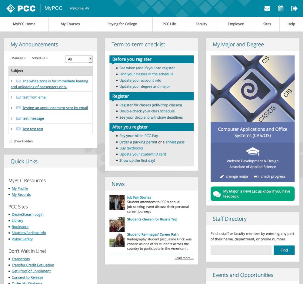
3 columns – even
This is the basic 3-column layout Luminis provides.
Development info and usage
3 Columnsin MyPCC admin- Used on:
- Home tab
PCC LifeStudent Guide tab (updated Sept 2023)- Faculty tab
- Employee tab
- Non-credit home tab
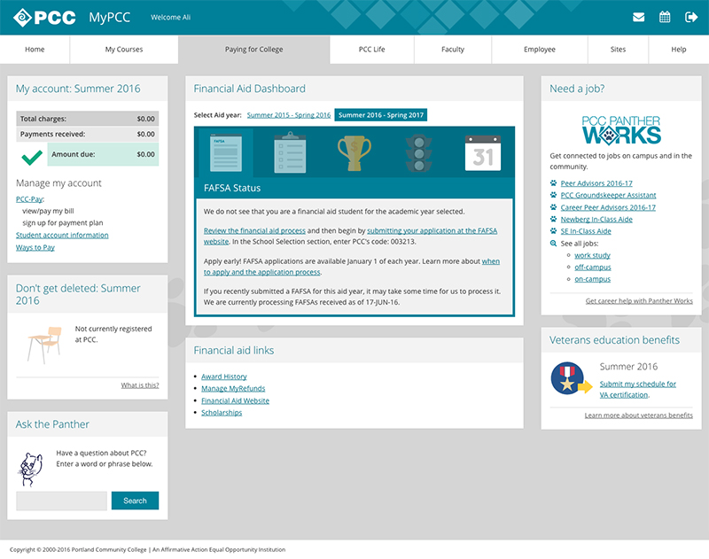
3 columns – wide middle
We created this layout for the Paying for College tab because the Financial Aid Dashboard needs more space. There is additional documentation about this custom layout in Spaces.
Development info and usage
3 6 3 Bootstrapin MyPCC admin- Used on:
- Paying for College tab
2 columns – even
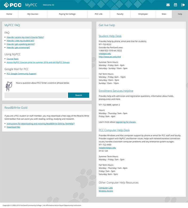
This is one of the basic 2-column layouts Luminis provides.
Development info and usage
2 Columns (50/50)in MyPCC admin- Used on:
- Help tab
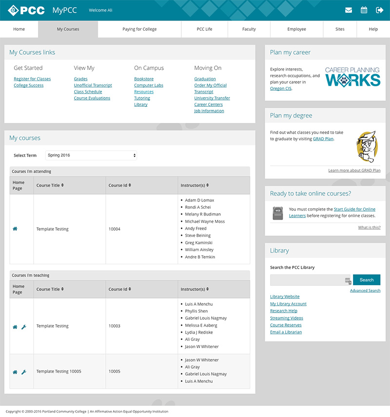
2 columns – wide left
This is one of the basic 2-column layouts Luminis provides.
Development info and usage
2 Columns (70/30)in MyPCC admin- Used on:
- My Courses tab
- Courses Home tab
1 column
This is the basic 1-column layout Luminis provides.
Development info and usage
1 Columnin MyPCC admin- Used on:
- Sites tab
- Courses Content tab
- Courses Links tab
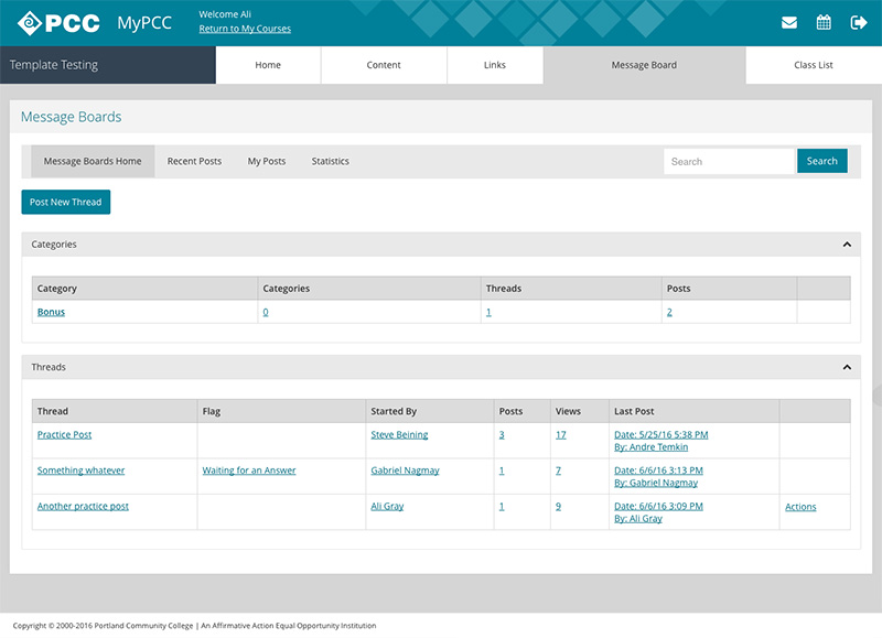
- Courses Message Board tab
- Courses Member list tab
Responsive layouts
The columns have percentage widths instead of pixel widths. This way, they resize when the screen resizes. There are four breakpoints, which trigger at certain screen widths and adjust the percentages. For example, a column that is 33.33% wide on large screens becomes 100% wide on small screens.
All layouts collapse to one column on small screens. The columns reorder with the left column on top, the second column in the middle and the right column on the bottom.
Horizontal – medium and large screens

Vertical – small screens
Breakpoint screen widths
- Extra small (phones):
0 – 479px - Small (phones and small tablets):
480 – 767px - Medium (tablets and small desktops):
768 – 991px - Large (desktops):
992px and up