Typography
Consistent use of typography supports visual cohesion and leverages an emotional resonance with our brand. It’s a powerful way to help people get to know our unique style and increase the impact of our storytelling.
Primary typefaces
Typography is an important part of the college’s visual identity system. When used correctly and consistently, typography unifies the appearance of marketing communications. Below are the PCC brand-approved typographic families, which include a serif, sans serif and slab serif option.
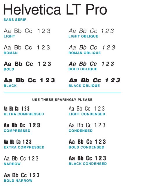
Helvetica LT Pro (san serif)
We recommend Helvetica LT Pro be used for all categories of content, including headlines, subheads, body copy text, pull quotes, footnotes, etc. Of the three primary typefaces, Helvetica is the most accessible font option for print and digital formats.
There are different versions of Helvetica available on various operating systems and applications. If you have access to Helvetica, Helvetica Neue or Helvetica LT Std, those fonts are acceptable and appropriate to use in lieu of Helvetica LT Pro. If you are not trained in graphic design, we suggest using only Helvetica and its provided weights.
The Helvetica font family has a large number of typeface variations. We recommend using the Light, Roman, Bold, Black and Oblique (italic) versions in all instances. Please use the Compressed, Condensed and Narrow versions sparingly.
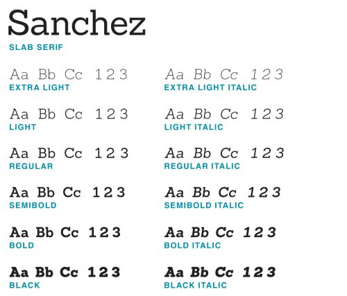
Sanchez (slab serif)
We recommend Sanchez be used sparingly. It can be used for headlines, subheads and pull quotes only. Because of the font’s slab serif style, it is difficult to read in paragraph form. We do not recommend using Sanchez for large paragraphs of text.
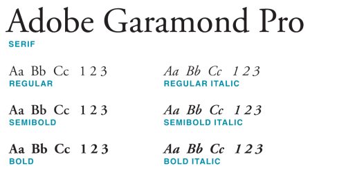
Adobe Garamond Pro (serif)
We recommend Adobe Garamond Pro only be used for large paragraphs of text.
Note: The Marketing Department has a limited number of licenses for brand-approved fonts. As such, we are unable to provide the primary typefaces for college-wide use. Many operating systems come with preinstalled versions of Helvetica and/or Garamond. However, if you do not have access to our primary typefaces, please utilize the alternative fonts provided below.
Alternative fonts
In marketing and communication materials, our primary typefaces should always be used. However, there are circumstances when brand-approved fonts will be unavailable. In those instances, these alternative fonts should be used. These alternative fonts are freely available in all Google applications and may be available on other operating systems. These alternative fonts are recommended for business correspondence, as well as email signatures, slide presentations and websites.
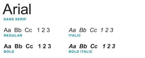
Arial in lieu of Helvetica LT Pro (san serif)
We recommend Arial be used for all categories of content, including headlines, subheads, body copy text, pull quotes, footnotes, etc. If you are not trained in graphic design, we suggest using only Arial and its provided weights.
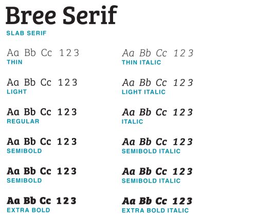
Bree Serif in lieu of Sanchez (slab serif)
We recommend Bree Serif be used sparingly. It can be used for headlines, subheads and pull quotes only. Because of the font’s slab serif style, it is difficult to read in paragraph form. We do not recommend using Bree Serif for large paragraphs of text.
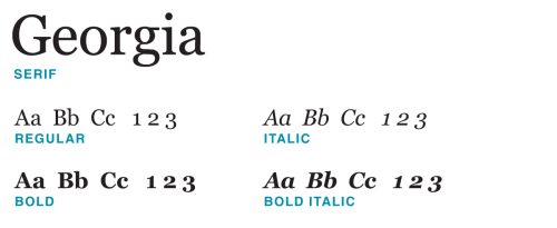
Georgia in lieu of Adobe Garamond Pro (serif)
We recommend Georgia only be used for large paragraphs of text.