Good composition
Whether you’re choosing a photo from a repository or taking the photo yourself, it’s important to consider composition. Composition is a fairly complicated topic, but the basics are easy to grasp.
What is composition?
Composition is the placement or arrangement of visual elements in a photograph. These elements include the subject or subjects, other foreground and mid-ground elements, and the background.
You can change the composition by moving the subject and other elements around before taking the photo, or by cropping the photo on a computer.
How to shoot a well-composed photo
The easiest ways to improve composition are to:
Get closer to the subject when taking the photo
- This is the easiest way to make your photo all-around better. It will be more evenly lit, in better focus, and have a better composition with minimal effort. The most difficult part of this trick is to not be shy!
- When the subject takes up more of the frame, there will be less clutter in the background, and people are most interested in other people’s faces, anyway.
Eliminate clutter
- Clutter is distracting, and you want people to focus on your subject.
- Place your subject in front of a blank wall (brick, a tree, or other subtle textures also work).
- Blur the background (requires a camera that lets you control aperture).
- This happens naturally if you get closer to the subject – the amount of background clutter you can see gets smaller.
Don’t center your subject
- Think of a tic-tac-toe grid placed over the top of your image, and position the subject along the lines or at one of the places they intersect.
- Images with centered subjects naturally look a bit off and unbalanced to most people at a subconscious level. They’re also not as interesting, unless done for creative effect.
Avoid cutting people off in the wrong places
- In general, try to not cut people off at the elbows or knees.
- Make sure you get their full heads in the frame – no one looks good with the top of their head missing.
Examples
A single subject
Good composition
 This photo is excellent.
- The subject is positioned to the side of the image, not in the center.
- There is plenty of space to her right, left, and above her.
- You can see her environment even though it’s blurred.
- She’s in good focus and seems to come forward against the blurred background.
- The background isn’t distracting.
- She’s looking toward the empty space to her right. This gives the photo a sense of being complete. If she were looking to her left, it would give the photo a sense of uncertainty – we can’t see what’s over there.
- The lighting is bright and even.
Bad composition
Awkward – don’t do this

Much better – do this

The photo on the left above isn’t terrible, but it’s a little awkward and not nearly as interesting or compelling as the photo in the “good composition” example.
- Centering the subject is usually not interesting – position the subject to one of the sides, instead.
- The top of her head is cut off. Try not to crop off the tip of the subject’s head, and don’t crop people at the knees or elbows if they’re standing up or sticking their arms out.
- The “better” example above is cropped closely enough that it seems intentional, rather than accidental, that the top of her head is out of the frame.
- You can’t see her environment – try to leave some space around the subject unless it’s a tight portrait.
- Her face and body are the same size. If going for a tight portrait, crop the subject in closer and leave off the body.
Another single subject bad composition
 This photo also is not in focus and has bad lighting.
- The subject is centered and too far away.
- The woman is the subject, but all the other things in the photo are competing for importance. Everything is in focus and about the same distance from the camera as the woman.
- The viewer probably isn’t interested in office 301E, what’s for lunch in the kitchen, or what time it is. Focus on her face instead!
- She is cut off at the knees. Ouch.
- Getting closer to the woman would remove most of the distracting background, and help the camera take a photo that is more evenly lit and in focus.
Activities
Good composition
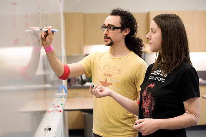 The photo above has a good composition, and is interesting as well as compelling.
- The subjects aren’t centered.
- You can see that the man is writing on a whiteboard, but you can’t see what he’s writing. The focus of the photo is the people, and being able to clearly see the writing would just be distracting.
- The photo was taken from an angle where you can see the people’s faces – they’re what’s important, not what they’re writing.
- There’s ample space around the left, right, and top of the subjects.
- The lighting is bright and even.
Bad composition
 The photo above, in contrast, has a bad composition.
- Even though the man is off to the side, the whiteboard (the subject) is centered.
- If the whiteboard is the subject, it’s difficult to see what is written on it – get closer!
- Half of the man is awkwardly cut off.
- There’s a distracting bright red can of soda in the midground.
- There’s a lot of boring empty space off to the right – everything is packed in on the left.
People and spaces
Good composition
 This one nailed it.
- The people are solidly in their space, and are standing in interesting stances.
- You can see their entire space – it isn’t distracting because it’s supposed to be part of the photo. They’re showing off their resource center!
- The text “pcc.edu/vetsuccess” is relevant to the photo and the full text is included.
- The lighting is even and the photo is in focus.
So close!
 This photo almost has a good composition (even though the focus isn’t great).
- The minimal wall background isn’t distracting.
- The “women’s resource center” text gives the photo context and is interesting.
- The women are off to the side.
- But their feet are cut off!
Avoiding clutter
Good composition
Choose a hero

Model or use it

- The photos above aren’t cluttered.
- There’s a hero – a main subject.
- The blurred background and white background aren’t distracting.
Bad composition

- The photo above is very cluttered.
- Viewers don’t know where to look, and it’s difficult to see or identify the subject.
- Better: shoot the products against a plain background, shoot fewer items at once, or have someone use or model the products.
- Choose a hero! Everything in this photo is competing to be the most important.
- Limit the use of color and patterns. In this photo, it’s difficult to differentiate the products from each other and from the background.