Juan Cervantes | “At Peace”
This media file is attached to: Painting / Watercolor
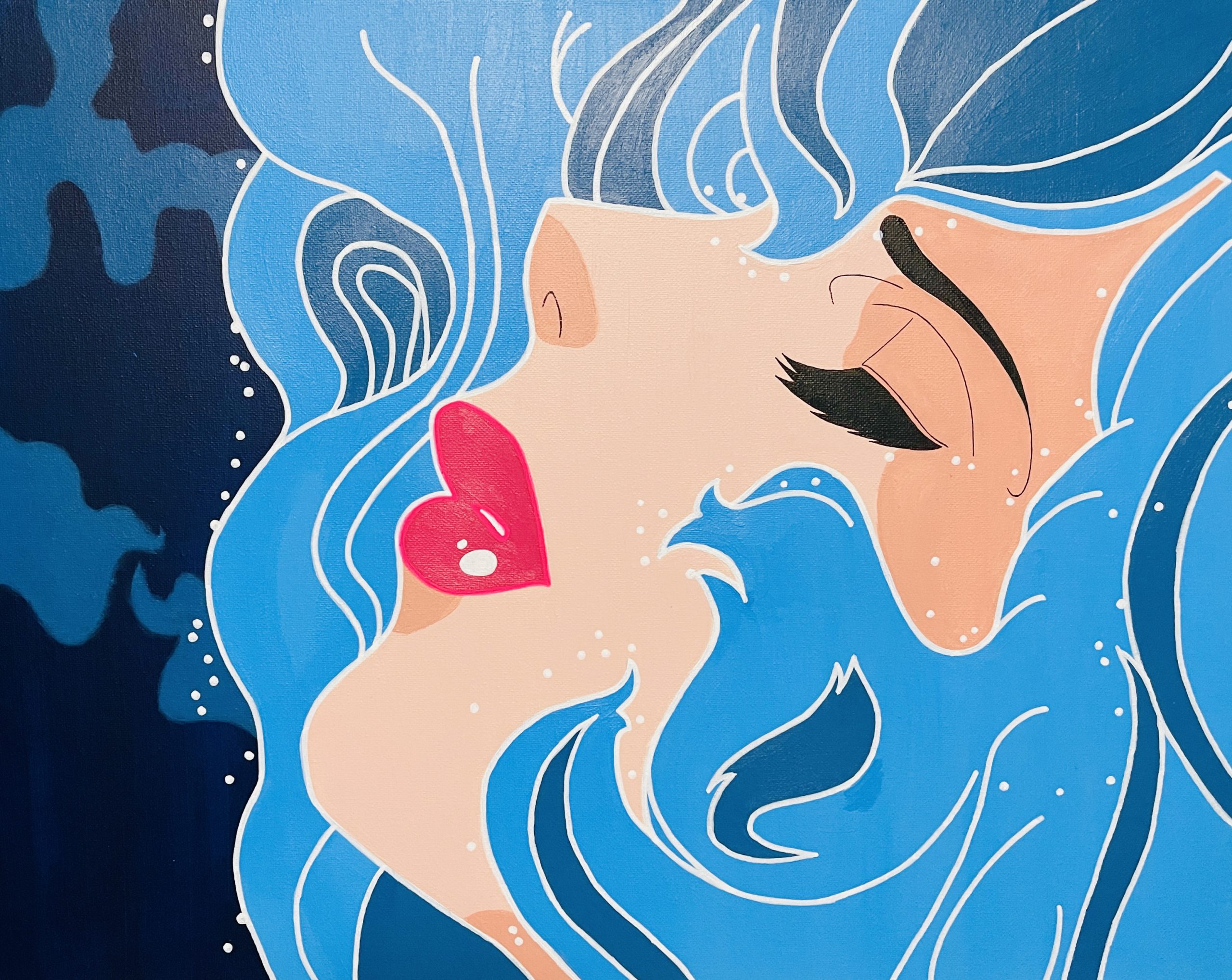
This is an artwork that I did in my painting one course, and the function that I decided to go for out of the seven parts of art was hope/peace. To represent hope, I decide focusing on color and which color suits the word hope. The color that I chose to use mostly throughout my painting is blue (different shades) to show a sense of peacefulness, comfort, tranquility, and relaxation. Since I discover that the color blue can help calm your mind, slow down your heart rate, lower your blood pressure and reduce anxiety and is essentially soothing. Another reason why I chose this color is because of the function I decided on; Hope! Even though blue might not correctly represent hope, for me, it does. I used it because we should be at peace and faithful to be hopeful. That's how I felt throughout my painting session, very relaxed and at ease because of the color blue, enjoying every moment of it. I used a canvas, acrylic paints, pens, and a Sharpie.