Redesign
PCC website history
The PCC website first launched in 1996! Check out how the website has changed over the years »
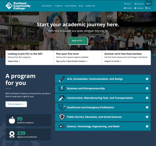
The Web Team launched the current pcc.edu website homepage in June 2022. The goal of the new homepage design is to realign with current marketing and recruitment efforts and college priorities. The rest of the website was updated in 2016 to align with the college’s refreshed visual language, including new signature colors and fonts, as well as to update the code base and make the site more accessible. We again updated the website in 2024, making minor updates to the style (bold headings and rounded corners on many web components) and again modernizing the code base.
Homepage redesign objectives
Content: what do we want people to do?
The content of the page prioritizes recruitment and enrollment, and puts more emphasis on future and new students while still providing avenues for other audiences to get what they need.
The primary goal of the page is to get new students to apply to PCC, or at least visit the admissions page. If they don’t apply, the goal is that they submit the request for information (RFI) form or visit a programs page. The page also shows things to back up why students should apply, such as PCC’s wide variety of programs, competitive cost, convenient locations, supportive services, and welcoming community.
Design: what is the tone?
We wanted to make the page approachable, friendly, and easy to use. Through the design, we hope the page is empowering, affirming, and encouraging, and helps students feel supported, safe, secure, and welcome. We want to be action-oriented but not forceful, and to help people envision their future selves.
2024 update
Main objectives:
- Modernize the code base (update to the latest font library and framework version).
- Align the rest of the website with the homepage redesign (rounded corners on many web components, bold headings).
2016 redesign objectives
Our main objectives for the redesign were to:
- Update the PCC website template to optimize our pages for viewing on mobile devices.
- Update website colors and typography to match the college’s new visual identity.
The content and navigation were not part of the redesign, and remained almost identical to the previous version of the website.
Updated visual identity
Continuing the process that started during PCC’s 50th anniversary, the college is working to align its visual language across all mediums with consistent brand symbols, fonts, and signature colors. This update to the website is the next phase of that iteration, with small stylistic changes that align with the college’s brand expression so that all of our communication “speaks” with one united “voice.” Coming soon, the Office of Marketing and Communications will release an online toolbox based on these updated visual identity standards. It will include tools and templates to help departments and individuals at PCC meet their communications goals, no matter what they are.
Redesign goals
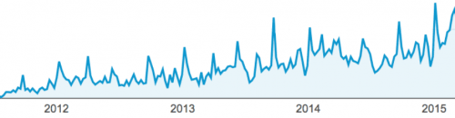
- Enhance usability across multiple platforms and devices – as of 2015, when the redesign project began, over 25% of the visitors to pcc.edu were using a mobile device. Here is a graph showing mobile traffic to the PCC website from 2012 to 2015:
- Use modern standards and technology to better support future efforts, including:
- Web standards (HTML5, CSS3, WAI-ARIA), Framework (Foundation), Repository (Git)
- Break out of the “folder” layout, which mimicked a real-world folder with tabs
- Better align with recent branding, add school spirit
- Update style guide for page layout, components, image treatments, etc.
Redesign challenges
All of the above, plus:
- Amount of content to address (~10,000 pages, not including the schedule of classes and other web applications)
- Types of content to address responsively
- Tables, dynamic content, tabbed content, forms, unique and one-off designs
- Designing in an environment where everyone has needs and interests
- Staying focused on the primary objective
- Keeping focus on this effort, while many projects compete for time